Do you want to impress your boss?
Do you want to see the bigger picture at work more quickly?
If you answered “Yes” to either or both of these questions, then read on.
You may be thinking…..”What is a pivot table”? Well, a Pivot Table summarizes a large amount of data into a simple and easy way that allows the user to see what the important numbers are in the data. You may have thousands of rows of data, with some rows that are less significant than others – so Pivot Table will let you choose the important summary metrics and summarize the data according to the metrics you choose.
Learn how to use Pivot Tables and become an instantly more valuable employee!
This is a step by step guide to creating Pivot Tables in Excel. There are only 7 steps!
It is a tutorial for Pivot Tables in ALL versions of Excel from 2007 onwards – Excel 2007, 2010, 2013, 2016, 2019, Office 365, etc.
We’ve deliberately used a SIMPLE example, as it easier to learn things with simple examples.
To start, open the file for the Pivot Table tutorial by clicking here: link to file
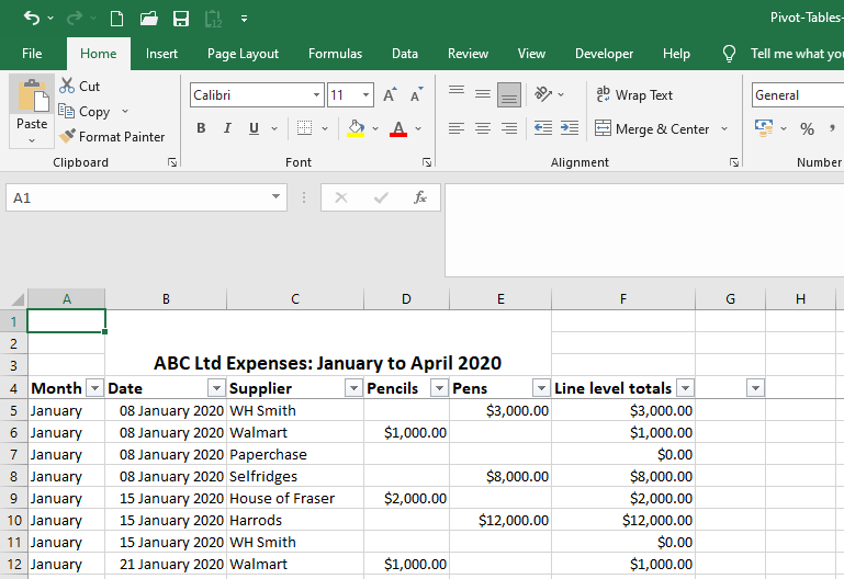
A screenshot of what the file looks like is below:
Screenshot of what the file looks like, when you open it.
You will see that the Excel table shown in sheet 1 in the file shows the expenses paid by company ABC Ltd over a period of time, starting on the 8th of January 2020. The table has over 81 rows and you can’t see at a glance how much was paid for Pens and Pencils in each month – there are 4 months in it January to April, and given that there are so many rows, this is where a Pivot Table comes in handy! The columns in the spreadsheet are:
- Column A – Month – the month that goods were purchased in
- Column B – Date – the date within that month that the goods were purchased
- Column C – Supplier – the company that the goods were purchased from
- Column D onwards – the goods that were actually purchased – pencils in column D and pens in column E. I had added more “Goods” / “Products” but let’s keep it simple.
We’ll use a pivot table to summarise
- The expenditure by MONTH and
- The expenditure by GOODS purchased
The Pivot table will make it easy to see these figures at a glance – that’s their function – summarising large amounts of information in a smaller, digestible format.
Step 1
Click on sheet 2 in the spreadsheet – we want to have the Pivot Table in a separate tab, so that it it is easier to look at when we’re finished.
Step 2
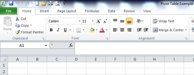
You will automatically be in cell A1
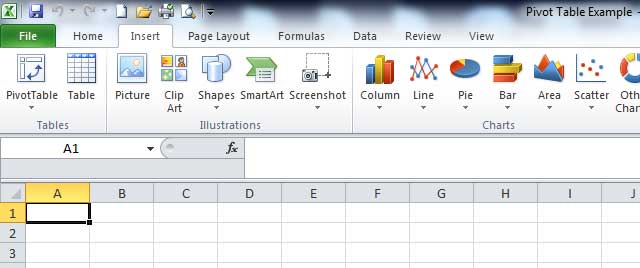
Click on the Insert tab in the toolbar – it is to the right of the Home tab (see image 1)
Step 2
On the left hand side, you will see an icon called “pivot table” (see image 2 below)– click on it, then click “Pivot Table” (instead of “pivot chart”)
Step 3
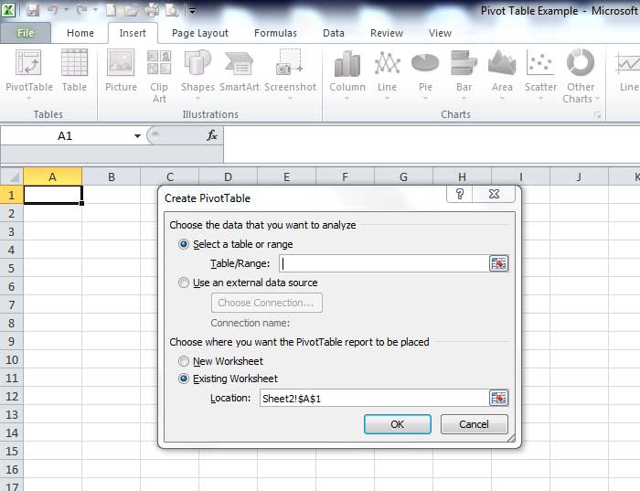
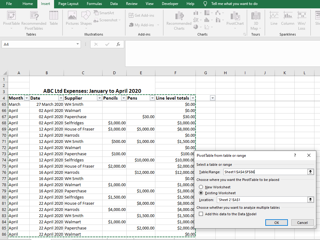
The “Create Pivot Table” window will have popped up (see image 3 below) and here you will need to specify the range of data that you want to create a Pivot Table for.
Step 4
At this point, you need to click on “Sheet 1” in the spreadsheet (because that’s where the data is that we want to create the pivot table for). The cursor will already be in the right place in the “Create Pivot Table” window (see screenshot above), so all you have to do is highlight cells A4 to F86 in Sheet1 – Excel will automatically put in $ signs for you when you do this, as it is fixing the range of data you are looking at – that’s what dollar signs do! See image 4 below. NB if the numbers and letters in your “Table/Range” field shown in the screenshot below are in any way different, then you’ve made an error and you’’ll need to ensure they match. But if you followed the instructions, there’s no reason why they shouldn’t!
Step 5
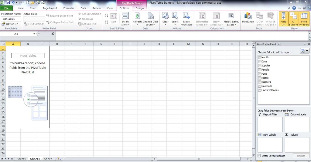
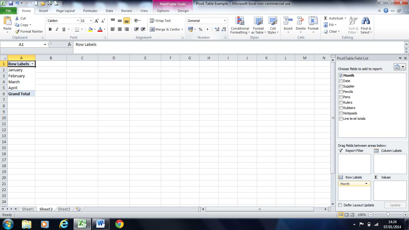
Click “Ok” – at which point Excel will take you back to “Sheet 2” (see image 5 below). Now go to the right hand side of the screen, where it says “Pivot Table Field list” / “Choose Fields to add to report” and tick MONTH. Your screen should look like IMAGE 6 below – there is a grid of four squares and MONTH should appear in the “Row Labels” square.
Step 6
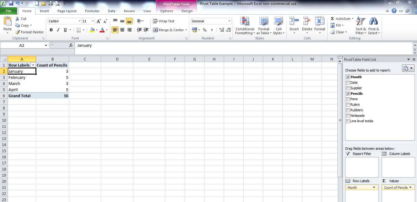
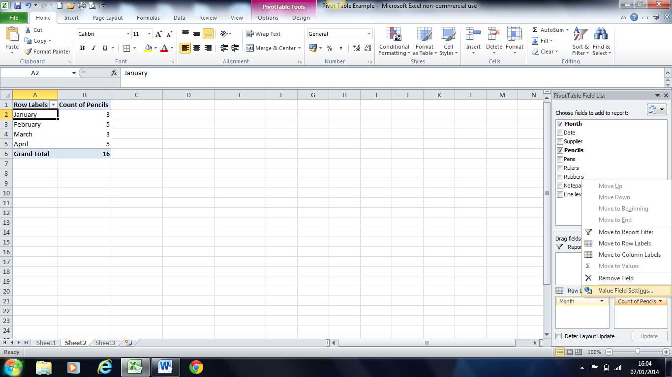
This is the tricky part – drag your mouse over to the word “Pencils” in the “Pivot Table Field list” / “Choose Fields to add to report” and drag it down to the “Values” square out of the four squares. Your screen should now look like IMAGE 7 below where the values square has “Count of Pencils”
Step 7
The “Count of Pencils” calculation counts the number of times Pencils were purchased each month, but we want to change that to “Sum of Pencils” so we can see how much was spent on Pencils each month.
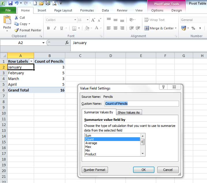
To do this, click on “Count of Pencils” then click “Value Field Settings” (see IMAGE 8 below) then in the “Value Field Settings” window that pops up (see IMAGE 9 below), click on “Sum” then click on “Number Format” in the same window – also shown in the screenshot, and change it from “General” to “Currency”. Under the “Decimal Places” field, you’ll be able to choose a Currency – the default Currency will be based on the country you live in. But if it’s not US Dollars, you can change it to ” $ English (United States Dollars)” so it matches the data in the screenshots.
Now click ok – that will return you to the “Value Field Settings” table.
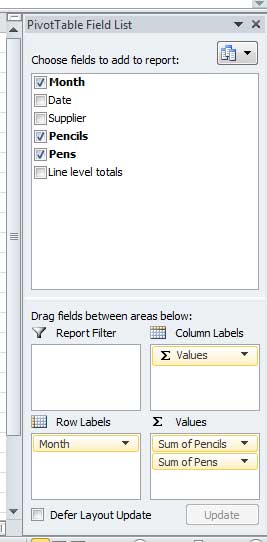
Click ok again, then repeat Steps 6 and 7 for the “Pens” in the “Pivot Table Field list” / “Choose Fields to add to report”. When you repeat Steps 6 and 7 for “Pens” you will notice that the sigma sign and the word “Values” will appear in the “Column Labels” square (see image 10 below).
But don’t panic, this is ok! It’s simply the titles for your columns, which will now be “Sum of Pencils” and “Sum of Pens”, respectively.
We need to change the Currency for “Sum of Pens” to US dollars, if it isn’t already US dollars. To do that, we’ll repeat the steps we did above for changing the Currency of the “Sum of Pencils” but we’ll do it for “Sum of Pens”.
So just click on “Sum of Pens” (where it is below “Sum of Pencils”), then click on “Value Field Settings”
Then in the “Value Field Settings” window, click on “Sum” then click on “Number Format” in the same window and change it from “General” to “Currency”. Under the “Decimal Places” field, change the default Currency to US Dollars ( if it isn’t already US dollars, by selecting ” $ English (United States Dollars)” in the “Symbol” drop-down list.
Now click ok – that will return you to the “Value Field Settings” table.
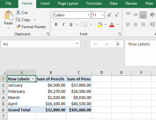
This will now complete our Pivot Table – ie it shows at a glance how much money was spent in each month on “Pens” and “Pencils” as well as the Grand Total for each in row 6. If you want to test this, you can go back to Sheet 1 and check the Totals in row 87.
OPTIONAL STEP – with reasons why a Pivot Table may disappear and another field to add.
You can also manually check how much was spent on “Pens and “Pencils” for each month in Sheet 1, but that beats the point. The Pivot Table’s done that for you! To make the Pivot Table more “flashy”, and gain a better understanding of how they work, go to Sheet 2 and tick the “Supplier” box in the “Pivot Table Field list” / “Choose Fields to add to report” window. If it’s disappeared, don’t worry – it will only have disappeared if you clicked outside of the Pivot Table in Sheet 2 eg if you clicked cell E1, it would disappear! But if you clicked on cell A1, the table on the right would magically re-appear! And voila, you can tick “Supplier” to see how much was spent on each “Supplier” each month for the different products. When you do this, it will look like IMAGE 12 below. That’s it! The comments box is below if you wish to post a comment! Please feel free to ask questions, if any of the steps are not clear.
We ask that you take a moment to read our Terms and Conditions and Privacy Policies.

Thank you for making this informative and concise!
You’re most welcome!
Glad we could help!
Thank you!!
You’re welcome!
So easy to follow, understand and instantly become a pivot expert potential in a couple of minutes. Kudos!
Thanks Iesha! We appreciated the feedback! Glad we were able to help!
Have a good day!
Thank you for such clear, unambiguous instructions as well as explanations on why we’re doing what we’re doing!
No problem! You’re welcome!
Thank you for the feedback! Have a great day!
Thank you soooo much!!!! You have taught us very well. I do appreciate the sample file where we can practice and do it ourselves. This is very helpful to a Visionary person like me. 🙂
Hi Jaime
You’re most welcome!
Let me know if you have any other questions.
Analyst
Very easy to understand. I have been scared of Pivot Tables but after this I feel I have a good foundation to build on. Thanks ALOT!!!
You’re most welcome, John!
Thanks for the feedback – it is appreciated!
Because we added the Country field to the Report Filter area, we can filter this pivot table by Country. For example, which products do we export the most to France?
Hi
Yes, if you have added countries to the data then you can drill down to show data for the different countries.
Analyst
This is a concise summary of how to create a pivot table. I took a workshop on this once, but your instructions bring it all back. Thanks
That’s great to know, Roberta.
Thanks for the feedback. And if you’d like help with anything else, let us know.
Your tutorial was helpful once I resolved some data issues.
1. The download is quite different from the data shown here.
2. The dates listed as February are in August.
3. Cell D72 had a space character in it causing an incorrect count in that column.
Awesome!
That is great feedback!
I’ll get that fixed ASAP – I owe you one! Let me know if I can help in any way.
Need to learn this for a new job. Your article was the best/easiest to understand that I found. Thank you!!
You’re welcome, Trisha.
Light bulb moment, I feel smarter!!! Thank you!
You’re most welcome, Sir T.
Glad I could help!
I am truly truly grateful to you for providing this tutorial on line. I am now confident to do some advanced stages too. Thanks once again.
Thank you for creating the Excel VLOOKUP and Pivot Table tutorials with corresponding workbooks.
I am taking an employment placement test next week that I hope will lead to a new employment opportunity!
How are you with Leverage and Earnings per Share (EPS)? I have a workbook from University that has a homework assignment that I could not solve and the professor would not help.
Thank you, Thomas
Hi Thomas
Thanks for your comment.
However, I’m quite busy working on other projects, at the moment.
Analyst
Thank you so much! You are a teacher who genuinely wants every student, irrespective of their prior knowledge, to master this topic. I am so grateful to you!
You’re welcome, Chitra.
Hi
Thank you for simplifying this, I never thought I would master it. You just proved how wrong I was! Just need more and more practice.
Freddy
hi,
Thanks a lot, it’s very useful and easy to understand. Great work.
Thank you for making pivots and VLOOKUPs easy to understand.
Ed
You’re welcome, Ed.
Excellent! This is very helpful.
Cool! Glad it helped, Don. And thanks for the feedback.
Analyst
Excellent tutorial. Thanks soooo much for your help. Its much appreciated 🙂
No problem. I am glad it helped you.
Let me know if you want me to cover anything else.
This was great but started in the middle for me, sort of. I was looking into this for my wife, actually. I was a bit confused when I saw the drop-downs already created in A4 through F4. THAT is what I thought the essence of a pivot table was, frankly.
So, this sort of taught me step-2 and now I have to go learn how to do that step-1, I’d call it.
Thank you! I forwarded this tutorial’s link on to my wife, for her use.
Hi Mike
Step 1 is just a spreadsheet with lots of data – this will be the case with all Pivot Tables – you’ll have lots of data that easy isn’t to read or glean summaries from. So a Pivot Table will help you summarize it so the info is easier to digest.
In this case, I have summarized the data from the opening screenshot (before image 1) by Month and Product (Pens and Pencils), so you can see how much was spent on Pens and Pencils in each month (image 11)
I have then added in Supplier – so you can see how much was spent with each supplier in each month and how much was spent on Pens or Pencils with each supplier in each month (image 12)
You can’t see these summaries in the first screenshot in the tutorial (before image 1), hence the reason we use a Pivot Table to give us a quick snapshot of what’s happening overall. Let me know if still unclear.
Analyst
I did’t know that it was so simple! Thank you very much.
No problem.
Thanks a lot. Great Example. You make it very easy to understand.
Thanks so much! What a terrifically simple explanation for Pivot Tables. You are my FAVORITE!
Cool! Thanks for the feedback.
Thanks for the help
Analyst you are the best. All the time I was thinking that I am not good at Excel and no way I can learn Pivot. Now I know exactly what to do. You did a great job. Thanks
Thanks Nayer – glad I could help.
This is by far the best and easiest to follow tutorial for pivot tables that I have found. Such a relief to finally “get it”!
Awesome!! Thanks ever so much for the compliment.
And let me know if you have any questions in future.
J
Thanks a lot. Bravo, good teacher
Thank you Diramo.
Used to live in Richmond upon Thames several years ago before relocating to Sydney. Your example indeed reminded me of my good old days in LDN.
Job well done once again! =) Thank you!
JL
P.S: Quick Qs for you.
Q1: Do you offer excel on-line tutorial on topics other than pivot table & vlookup by any chance?
Q2: Once I play around with pivot tables, I might feel like to make a graphical / visual representation of the fabricated data. In such case, do you recommend one like me to copy & paste the figures as “value only” in other sheet and plot the graph, perhaps? Any tips, recommendation on that part as an expert please?
Hi Jaekoo
London is great, and Richmond is very posh! Good choice!
Q1) I don’t offer tutorials on other topics at the moment (besides vlookups and pivot tables), but can certainly look into other areas. Is there anything in particular that you’d like to be covered? I created the Pivot Tables tutorial as a result of demand for it on my vlookup website.
Q2) You can actually create charts with Pivot Tables without having to copy and paste the data anywhere else. I’m writing an ebook and plan to include a Pivot Chart in it, but if you want help on a specific question with dummy data, let me know and I’ll be happy to assist.
Rgds
Analyst.
Thanks a lot
Thanks for the simple & easy to learn steps
You’re welcome.
suprrrrrrrrrrrrrrrrrrrrrrrrr
Thanks for Simplifying Pivot Tables.
No worries. You’re welcome.
You are wonderful! Thank you for the easy step by step examples
Thank you for your kind words. I appreciate it and I’m, of course, glad that the examples were helpful.
This is the most simplest and the most efficient way to learn Pivot Tables. I also learned VLOOKUP on this forum. Great job guys! You are awesome.
Thank you for your kind comments. Glad I was able to help.
nice way of explaining….
Thanks
Thanks,but my table did not look like yours while i was counting my pencils mine was 23 urs was 16. How is that possible? and I cound’nt highlight my table to i86 but to f86 because the was no information from column g to i
Hi Sibongile
Yes, you’re correct – the data only goes to column F, rather than I – thanks for spotting that. I’d originally created several columns, up to column I, but decided to remove the data in columns G to I to make the tutorial simpler to understand.
If you’re not getting the same result as the tutorial, please send me the file and I’ll have a look to see what’s gone wrong. Many other visitors have been able to replicate the results (as you’ll note from the comments below) but I’m happy to take a look at your file.
Analyst.
hi, i forgot how to reselect or refresh the pivot table range without repeating the process..
Hi Anna
Apologies for the delay. You just need to right click on the Pivot Table then click “Refresh”.
good article
Brilliant way to teach. Thank you very much
That was really awsomeeeee..
I have been embarrassed in my job for so long, always having to ask colleagues for assistance. When explained to me I have still struggled to understand.
This tutorial has finally enabled me to understand for myself!
I can’t thank you enough!
You’re most welcome. Thanks for the compliment.
I trembled when someone asked if I know how to do pivot tables – I feel more confident now!! Thank you…..on to the dreaded vlookup 🙂
Great.
Fabulous!
Thank you so much for this. Easy to follow and very well written.
Utterly brilliant!
Fabulous! Thank you so much for this. Easy to follow and very well written.
Excellent tutorial first VLookUps then Pivot Tables all made very simple. Well done
You’re welcome.
Great, simple tutorial. Thanks a lot!!!!
nice
Awesome that was easy and clear.Thank You
You did an amazing job with the tutorial on Pivot Tables and Vlookups. I took both and you made it so easy! I cant thank you enough!
Thanks for the feedback, I appreciate it.
Great job very easy to learn. thank you.
amazing thank you
Excellent way to learn Vlookup and PivotTables. just a suggestion please can you add some worksheets for practising and learning
Hi Sunita
There are two different examples on the vlookup site at the moment.
The basic one shown on one sheet here: http://howtovlookupinexcel.com/
And the more “advanced” one shown between two workbooks here: http://howtovlookupinexcel.com/vlookup-between-two-workbooks
I will look into adding another example on the Pivot Tables site in the next few weeks.
Excellent tutorial. Thanks so much, it was really helpful
Thanks!
Your teaching style is excellent.
Excellent
You’re welcome.
This is a very helpful and easy step by step process. Thank you